#TidyTuesday CEO exits of S&P1500
A look over two decades of data
Posted on April 28, 2021
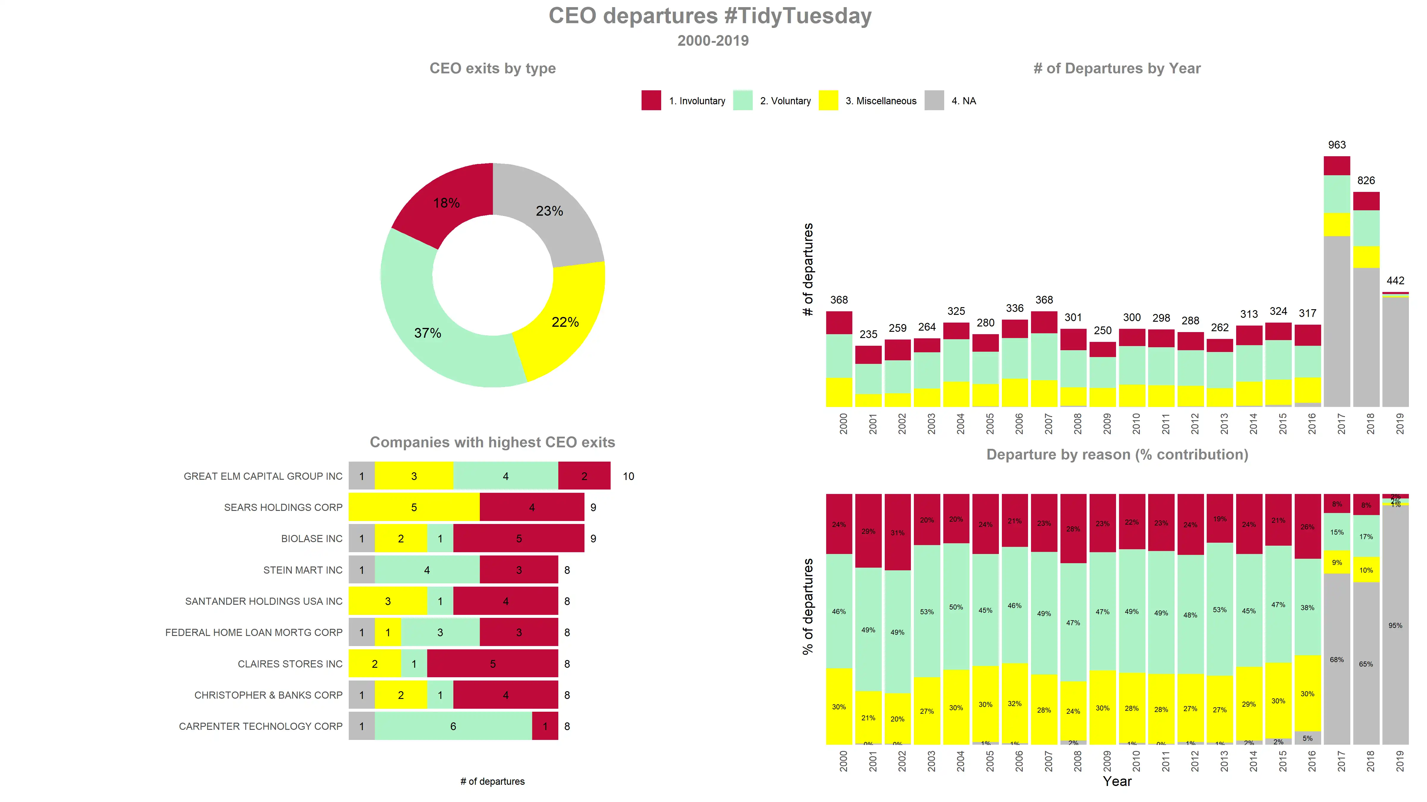
This week’s #TidyTuesday dataset is about CEO departures in S&P 1500 firms.TidyTuesday is a weekly data project aimed at the R ecosystem. I have taken 2000-2019 data and tried to plot the two decades of reason on why CEOs leave. The Outcome CEO departures have increased significantly in recent years....
[Read More]
Tags:
Tidyverse, R, CEO, exits, TidyTuesday, Tutorial, Patchwork
#TidyTuesday Netflix going global
Netflix going beyond borders to have truly global contents
Posted on April 26, 2021
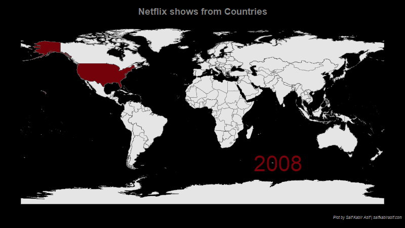
This is my first attempt at a TidyTuesday dataset. TidyTuesday is a weekly data project aimed at the R ecosystem. This week we got the Netflix dataset. Here, I am trying to observe how Netflix shows have expanded beyond border to have movies/TV shows from across the globe. The Outcome...
[Read More]
Tags:
Tidyverse, R, Animate, Netflix, TidyTuesday, Maps
Exploring News Sentiment: Feb'21
Are you getting positive or negative news
Posted on March 18, 2021
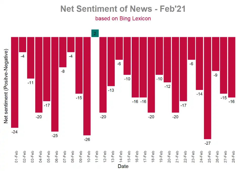
News_Feb_2021.utf8 It has been nearly seven months since I put up anything on my blog due to undertaking some life and time-devouring projects in my professional life. While my blog writing was de-prioritized, I managed to learn some tricks on text analysis through byte sized online learning. Today, I am...
[Read More]
Tags:
Tidyverse, R, Tidytext, News, tutorial, Sentiment, Bangladesh
Tidymodels : Exploring iris
Getting to know modeling the tidy way
Posted on August 4, 2020
Caret has long been the go-to package for machine learning with R. But it was not quite standardized like python counterpart scikit-learn. With tidymodels, this is about to change with caret developer Max Kuhn spearheading the project. In this project, I will run through the iris dataset to showcase the...
[Read More]
Tags:
Tidymodels, R, Tidymodels, DataExplorer, tutorial, Analysis
The Last of Us 2 : A closer look at user scores
Are first time reviewers bringing the score down?
Posted on June 22, 2020
Naughty Dog is one of the few developers who have been able to appease critics and users alike with games such as the Uncharted series and The Last of Us. But with the recent release of The Last of Us 2, that seemed to come to an end with critics...
[Read More]
Tags:
PS4, R, The_Last_of_Us_Part_2, Naughty_Dog, games, tech, Analysis